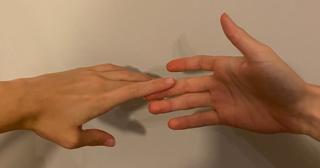
We were asked to participate in the Getty Museum Challenge. This is an art challenge where you recreate old paintings using objects in your own home. I chose this famous Michelangelo painting of these hands and my friend who's been staying with me during quarantine helped me recreate it because I have acrylic nails. The hardest part of this challenge in my opinion was picking an image to recreate in the first place. However,m this was a great assignment to do because it was super fun and lighthearted.
0 Comments
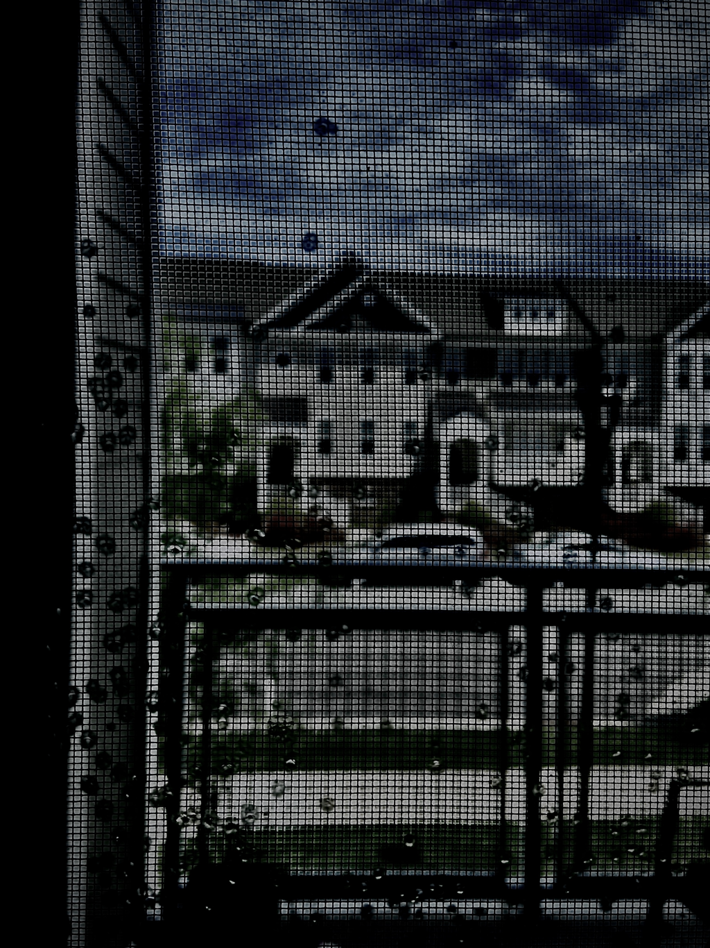 For our final photography project, we were told to take photos to describe the impacts of the corona virus pandemic, and to edit them accordingly. For my first photo, I took a picture of a littered mask I found on the ground near my apartment complex. This, to me, shows the impact of the virus because everyone has been wearing these masks and I can infer no one had picked it up because they had been scared of what germs could be on it. (I did pick it up with gloves). I edited it black and white and emphasized the shadows to accentuate that impact. My second photo is of a class meeting. (This class!) Since the pandemic, this has become the new normal to teenagers everywhere. I edited it black and white to show how teenagers are longing to go back to school and get back to normal. The very last picture I took was out my window overlooking the rest of the apartment complex. This was meant to show how quarantine is effecting us all, longing to go outside. To show this, I edited it so inside would be darker and shadowy and outside still had bits of color. I thought this was a fun project to show our situations into our artwork in a simple, fun and easy way.
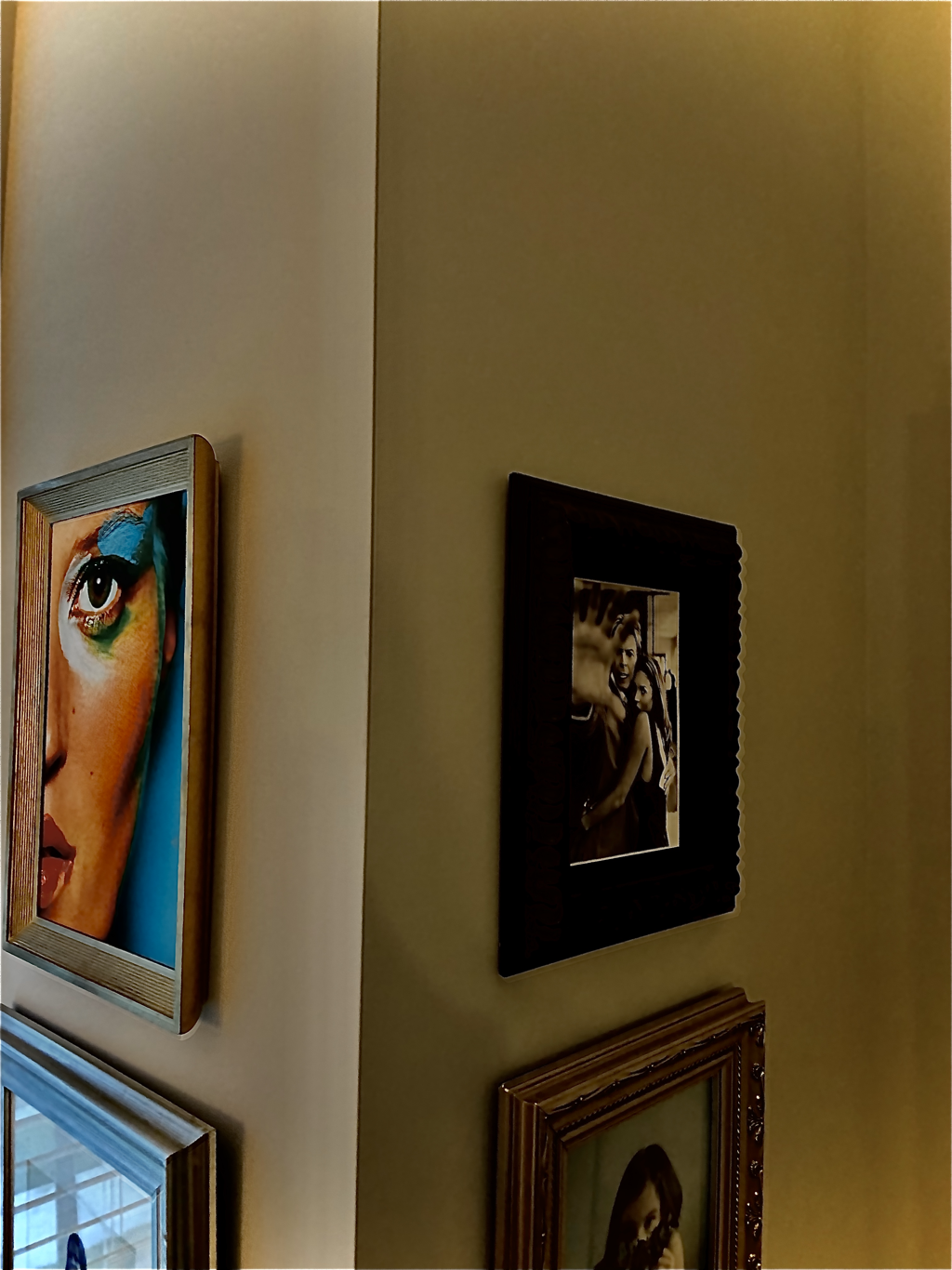 To introduce us to photography, we were told to take a picture of anything and try to edit it to make it look interesting. I took a photo of a corner wall that had different photos on it. I edited the saturation and shadows to accentuate the depth and lighting in the photo.
1. Describe the craftsmanship of your drawing.
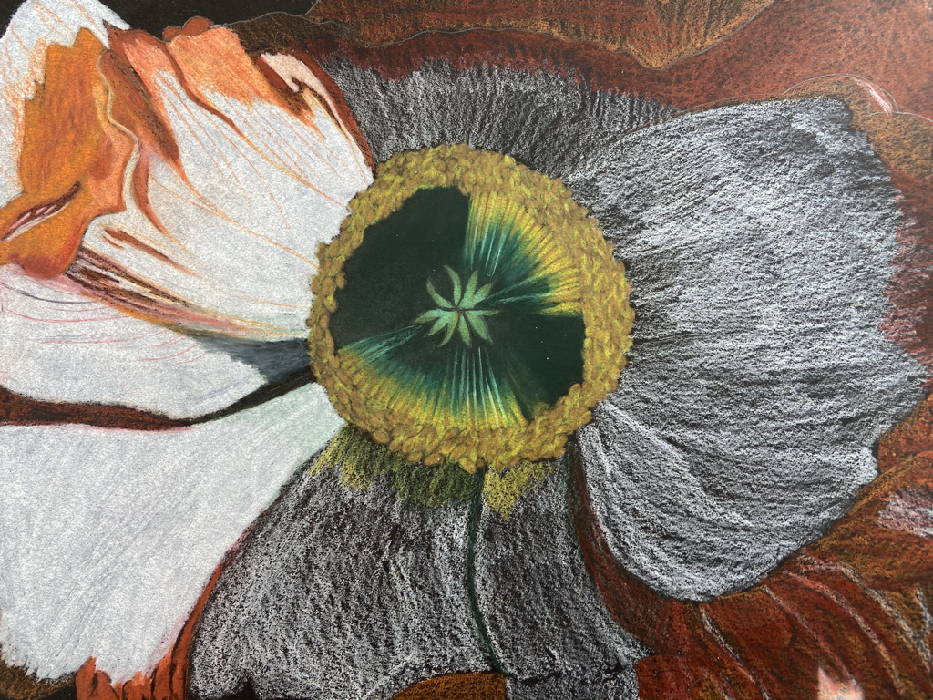
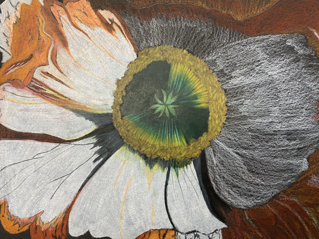
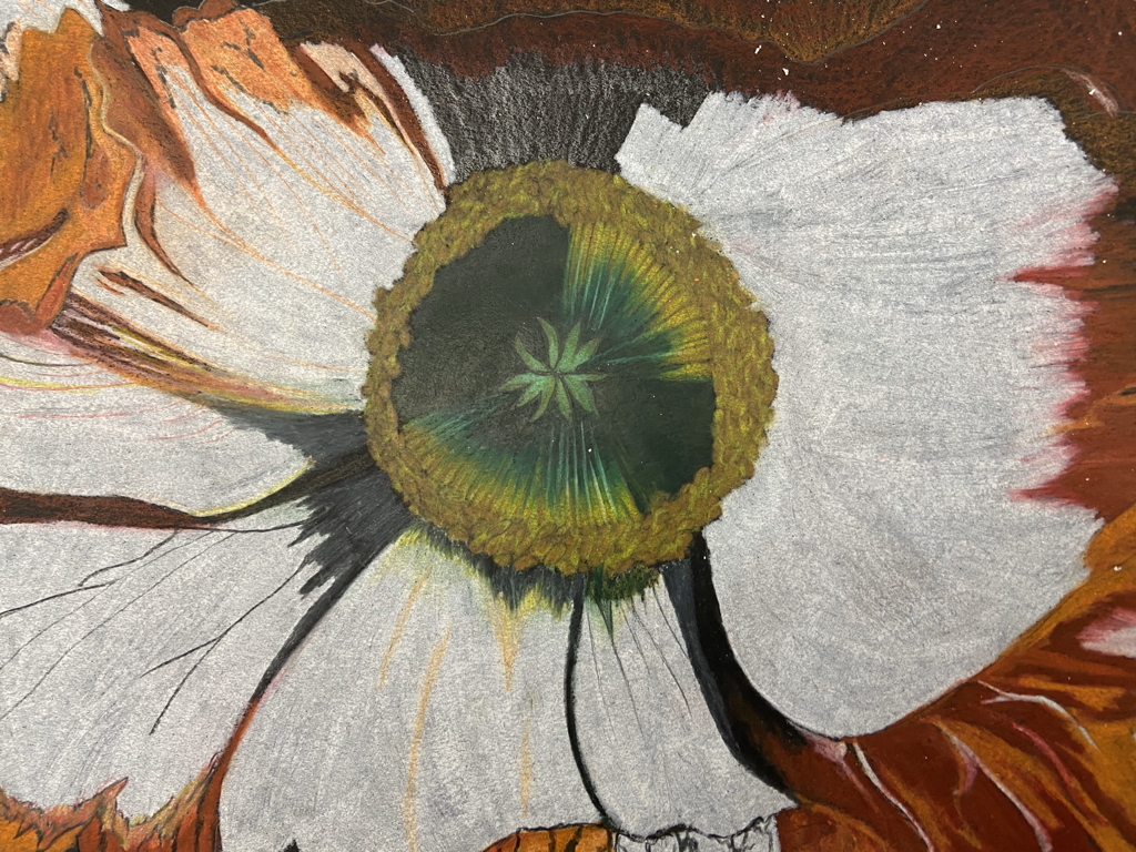
I wanted it to be decently abstract, so I wouldn't call it neat, but the attention to detail that I paid shows that it's well executed. 2. Do you think you used a full range of values to create the illusion of depth? I believe I did, from the shades of oranges and yellows to the greens and blacks. Especially in the shadows in between my petals I did show depth. In the center, I used dark green blended out to the rest of the stems to portray the look of them coming out of the darkness. 3. How do you think you represented the style of the artist Georgia O’ Keeffe? I represented her style by creating an abstract looking piece of close up nature. 4. Describe your choice of colors/color harmonies and how you used them throughout the artwork. The center is made up of yellows, greens, and a little blues in various shades blended together to give the illusion of depth. The petals are white and the insides of them are various shades of oranges, yellows, and reds. I used the reds specifically to show depth within the oranges. 5. How did you create contrast in your drawing? I created contrast by making the flower white with the insides being an explosion of oranges, yellows, and reds. I also created it by using black and gray to use as shadows. 6. How did you use textures, highlights and shadows to enhance your artwork?  This is my Georgia O'Keeffe inspired colored pencil piece. It seems to be of a peony. I used the white with the oranges and reds to develop contrast and to show depth of the flower. The blacks and grays in between some of the petals were also used to add depth. I used black to add detail to the flower and the petals. The center is made up of a range from yellows to greens and I shaded in part of it to add shadow. Ultimately, I am proud of this piece because I had never attempted to draw anything realistic and although it could be way better, I'm proud of this being my first finished colored pencil piece.
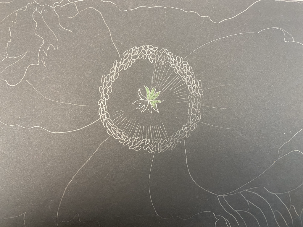
These are progress photos I took while I was drawing my final. The first one is after I had outlined my flower in pencil and begun coloring in the center. The second was after I had colored in where I wanted each color to go, after I had finished the center and started burnishing a couple flower petals. The third was after I had burnished two petals, and started on a third. And the fourth is the start of burnishing the largest petal, before I had started on the last.
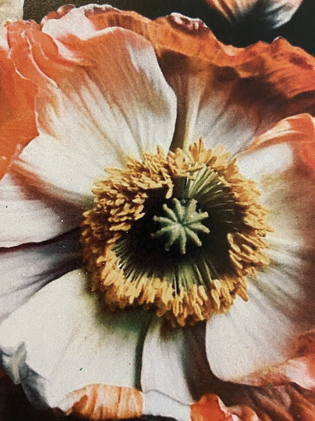
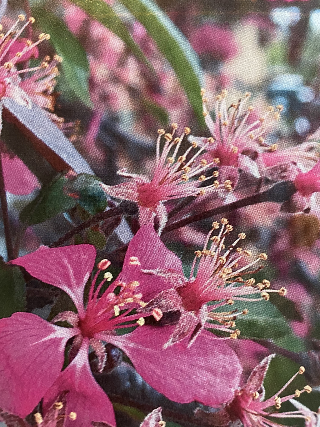
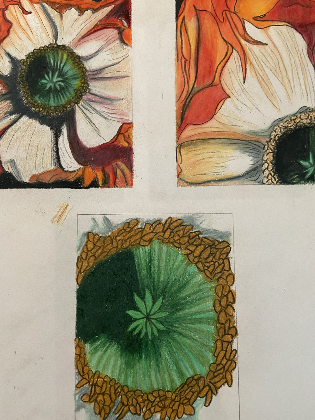
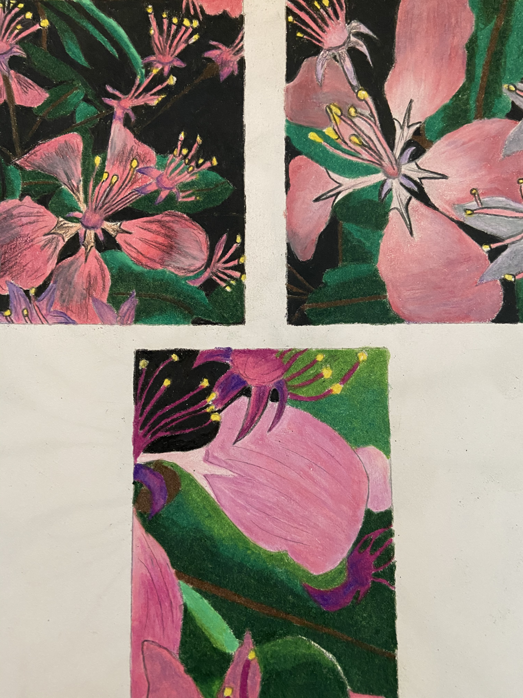
 Our final project for our colored pencil unit was inspired by Georgia O'Keeffe. We were supposed to go into nature and take 15 up close photos, then choose our favorite 2 and sketch 3 composition sketches for each of the 2 photos. My favorite pictures were of flowers, and they are the top two above. My composition sketches for each one are below their corresponding images. I chose The first sketches I made of the first flower to be my final, and the last photo is me brainstorming the type of techniques I want for my final project. I like the way my teacher had us brainstorm because I felt much more comfortable to start my final project.
To further practice using colored pencils, we imitated a cupcake. The picture on the left is the cupcake I chose to draw and the picture on the right is the result. In this piece, I worked on my blending, my burnishing, and highlighting. We were also encouraged to use colors that we believe might be there, even if we can't see them to add to the piece. As a result of this, I added purple and green, and I agree, it definitely adds a layer of dimension to the piece.
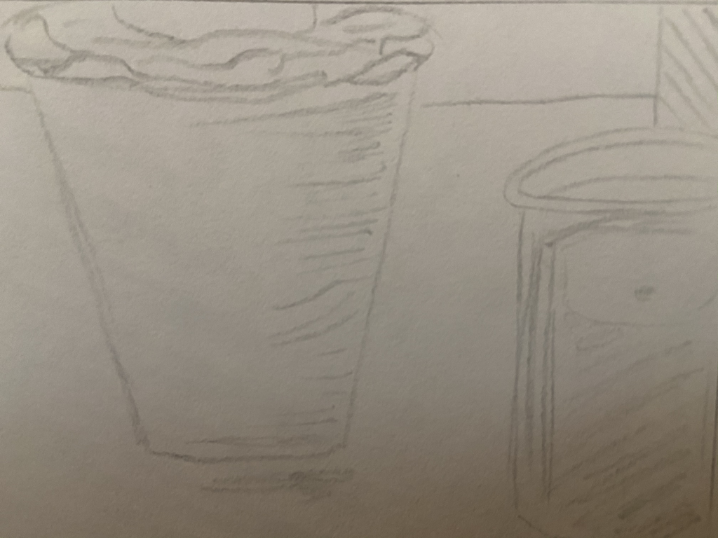
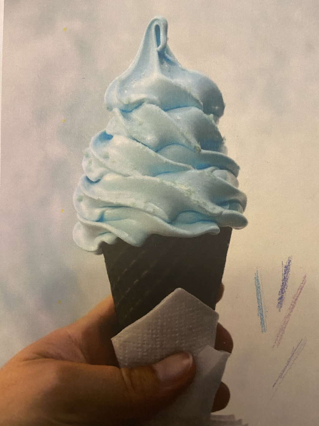
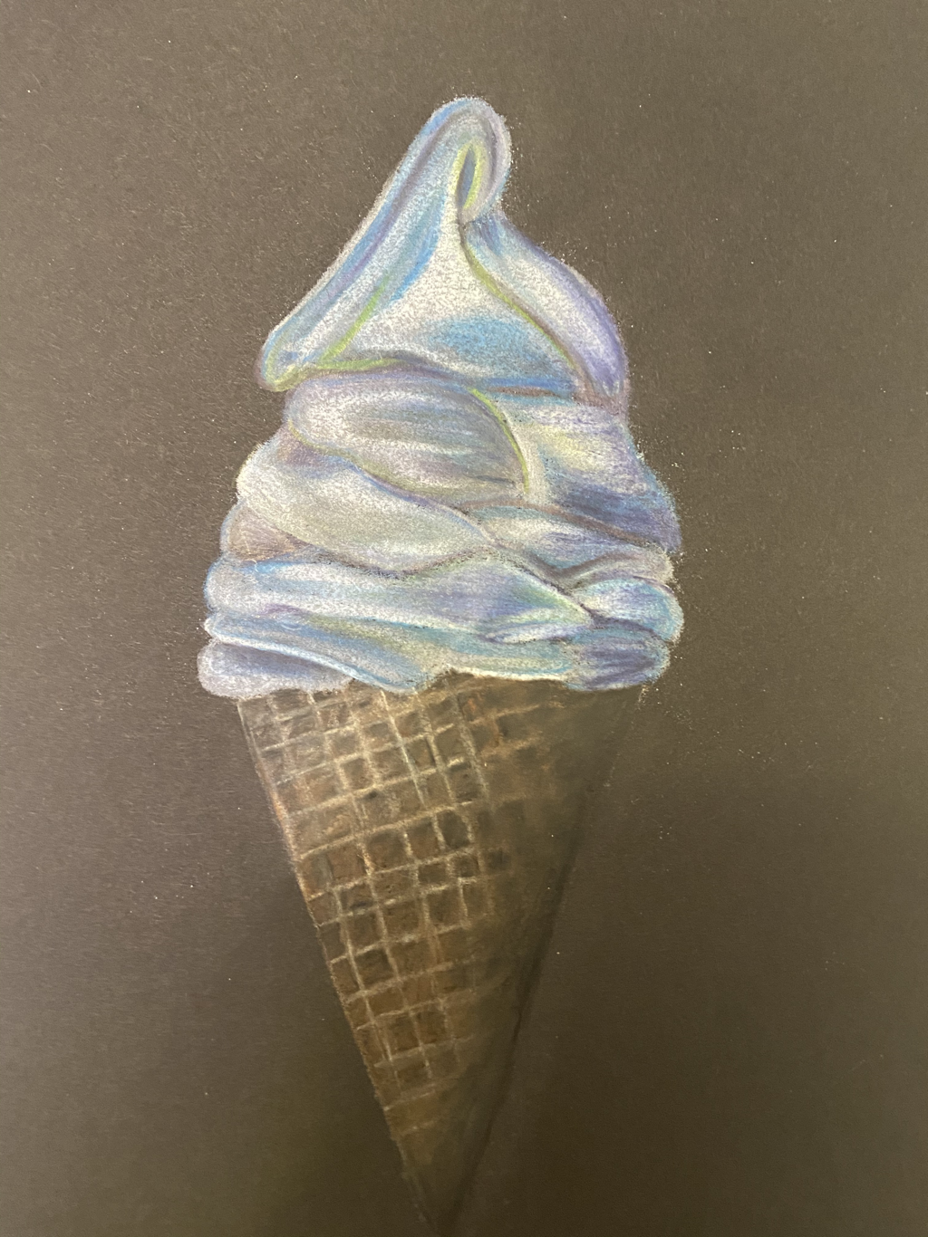
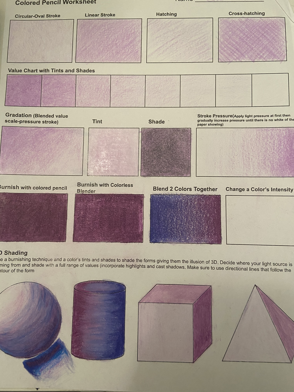
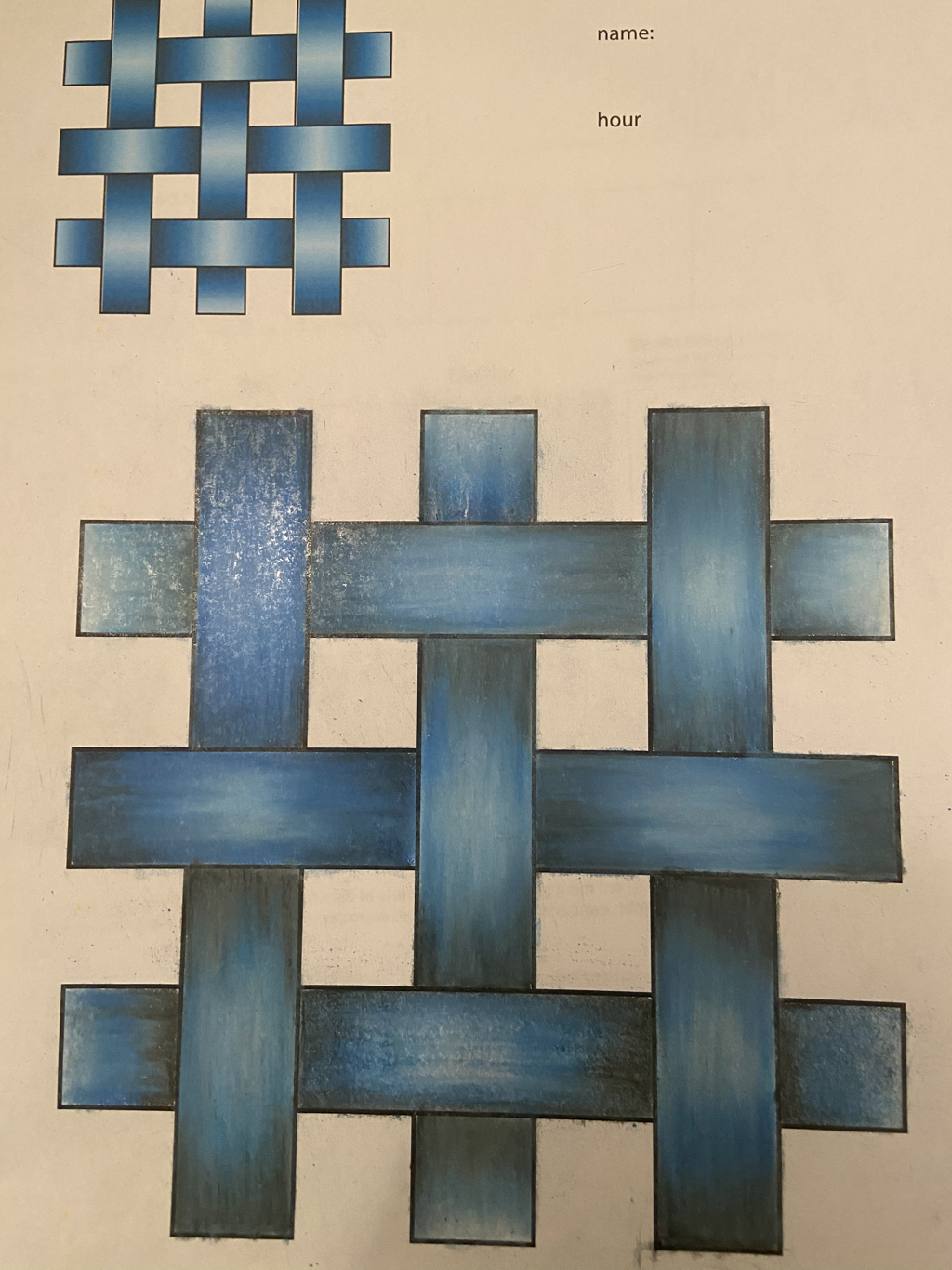
We began working with prisma colored pencil. To start off, we completed a worksheet to get used to different techniques, tints and shades, pressure, gradation, blending, and burnishing. The complete is on the left. At the bottom of it, we worked on 3D shading to make the objects look realistic. This was really hopeful to get us used to working with colored pencil before we did any projects. On the right is an activity we did before starting our ice cream project, to get us used to burnishing and blending the colors repeating the image at the top left corner. This was a really good activity to complete, just to work on our blending techniques and practice burnishing.
|
 RSS Feed
Photo used under Creative Commons from CarlH_
